
Tip #8: Pay attention to contrast. Remember my dining room example? The original tone-on-tone trim and wall colors didn’t work well together, at least not for the look I was trying to achieve. I wanted more contrast. More pop.
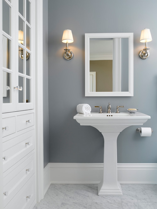
Like this room where the gray walls really stand out in contrast to the white trim, sink, mirror and cabinetry. Now, that’s a paint color to love for a long time.
For tip #9, let’s return to my craft room/office makeover. I told you before that I narrowed down my paint selections to two colors: Wordly Gray and the slightly darker Amazing Gray.
I know that paint colors look darker on a wall than they do on a swatch and once you get a whole room painted, a color can feel darker than the sample. I knew I would be working a lot in my office at all different times of the day and night. And I also knew the room doesn’t have the greatest lighting and can often feel dark, even in the daytime. But I need it to be bright so I can work. So, I chose the lighter, less saturated, color.
If you’re staring at a paint swatch and wondering if a color is going to be too dark, play it safe and step up the swatch. If you’re thinking the color is going to be too light, take a leap of faith and choose the darker, more saturated swatch.
Tip #10: Of course, you also want to always be mindful of the mood you’re trying to evoke in a space.
I didn’t mind dark and sultry gray for my dimly lit powder room, but that wasn’t the mood I was going for in my office.
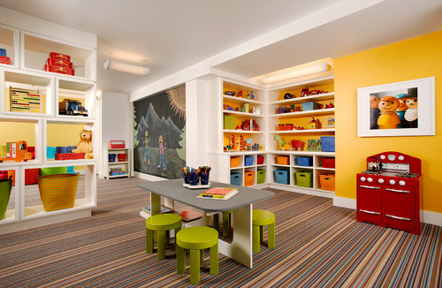
Bold and energetic works for a playroom.
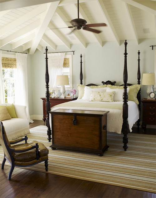
But maybe not so much for a master bedroom if you’re trying to create a serene retreat.
Tip #11: Transition and flow are other things to consider when choosing paint colors.
Pay attention to how one room flows into the next and how colors work together.
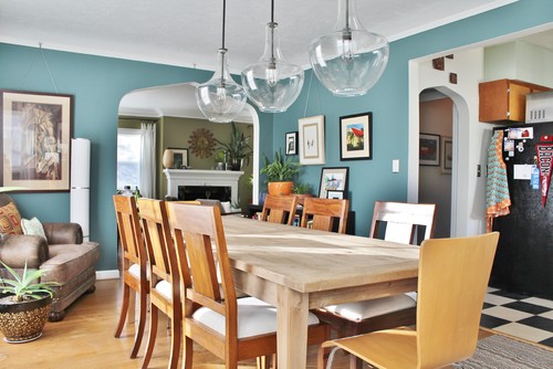
This is particularly important in open-floor plan homes. You don’t want jarring transitions or colors that clash flowing into one another. If you’re mindful of undertones, which I talked about in Tip #7, you should be pretty safe. Another rule of thumb: if you wouldn’t wear two colors together, then I wouldn’t paint adjacent rooms those two colors.
We’re to the end of my tips now, and Tip #12 is a doozy. Perhaps the scariest one of all.
Trust your instincts. If you love a color, if you keep coming back to it as you collect inspiration or you see it popping up in other ways — in the accessories you use in your home or in your wardrobe — go for it. If you love the color otherwise, you’ll probably love it on your walls.
OK, that seals the deal. I’m painting the dining room mason jar blue! Just maybe not this week.
For more paint color inspiration, visit my Paint Colors Pinterest Board.
Follow Atta Girl Says’s board Paint Colors on Pinterest.
And don’t forget to pin this post so you can find it later and share these tips with others who may be struggling with painting paralysis and white wall syndrome! Help cure these terrible decorating diseases!

Lora
We just moved into a new home and every room was painted a horrible color so I’m desperate to change them right away!!
Rick Norell
Very interesting article. We’re in the middle of a remodel and can’t agree on colors. My wife won’t let me bring in a professional to help us and declares we can do it even though she can’t decide what she wants… Grrr, I didn’t sign up for this, pick a color and paint it… 🙂
Atta Girl Amy
Sorry I missed your comment in the post holiday busyness. I hope you and your wife were able to decide on a color. And I’ve totally called in a professional in the past when I was having trouble making a decision about a paint color. Sometimes it helps to get a second opinion or to have someone help you narrow down all the choices. You can still use sample pots, to make sure you love the color, but you won’t have to buy so many of them. (Those little samples can be expensive.) Good luck with your remodel. They’re always stressful.
Mary McGinnis
What color is the aqua in your laundry room? And what color is your trim and wainscoting?
Atta Girl Amy
The laundry room is Watery by Sherwin Williams. I’m pretty sure the trim and the wainscotting is an old MAB color called Lyric White. I think Sherwin Williams bought MAB. They should have MAB’s old color formulas and can match this color.
andrea b
What is the blue on bath walls in tip #8? Thx
Atta Girl Amy
I’m not sure of that particular paint color, as it’s from a bathroom reno I found on Houzz. However, I find that designers over there are pretty good about responding to questions, so you may be able to get an answer there. Here’s the link: http://www.houzz.com/photos/1344121/Classic-Style-Condo-traditional-bathroom-minneapolis. Good luck.
Actually, I just clicked over to Houzz and the designer says the color is similar to Benjamin Moore colors: AF-545 Solitude
Jesscia Kratzberg
Could you tell me the color of the gray by the desk window? With the closet in the background.
Mackenzie
What’s the color of the gray bathroom–it’s wonderful and it’s just what I’ve been looking for!
Atta Girl Amy
Sorry for my delayed response. The color in the small powder room is Intellectual Gray form Sherwin Williams.
Yvonne @ StoneGable
Amy, great tips. I find choosing a paint color to be very very difficult! You tips will certainly help! xo
Shirley@Housepitality Designs
I love the “Chip It” software but I love doing it the old fashioned way by picking 3 colors that coordinate with the fabric, painting those samples on the wall and then live with it for a week…Great tips Amy!…have fun painting!!
Marty Walden
Brilliant post, my friend. Seriously, your writing shines through! As far s the topic, I’m sure my painter hubby would agree for all his customers, but apparently his wife lives life a bit more dangerously. Or maybe I unconsciously do these things and don’t know it. My inspiration usually starts with something from a yard sale and goes from there. Ummm, pick fabric first? hahahahahha
Thanks for the shoutout by the way!
Living on the edge,
Marty
Kirby Carespodi
I am using 2 paintings to pull colors from, but then I ALWAYS have to throw in lime green. What is it with me and lime green?? Was I a kiwi in a former life? And I LOVE Marty’s gray!!